Interactive plots of large data sets made easy: Datashader
Get this post as an interactive Jupyter Notebook and execute the code via Binder:
Update: Now using data from 2019 instead of 2018
Motivation
In a previous post, we’ve look at GeoViews as a convenient and powerful Python library for visualizing geo data. We’ve seen that it is able to plot tens of thousands of points on a map in spite of being fully interactive. In this post, we will explore another library that is part of the HoloViz initiative. Datashader is able to visualize truly large datasets by using an optimized rendering pipeline. HoloViews’ support for Datashader makes plotting millions of data points pretty easy, even while maintaining interactivity. In the following, we will again use our Cologne bike rental data to demonstrate DataShader’s abilities. Get the data here and follow along.
Plotting a whole year of bike locations
Our dataset contains all KVB bike locations for the whole year 2019. That’s going to be a lot of data to display at the same time. But this is where datashader’s strength comes into play. Other interactive libraries, i.e. bokeh, plotly etc. embed the data as JSON in an .hmtl file and let the browser do all the work. In contrast, datashader renders an image containing the processed data at the appropriate level. Consequently, all the hard work (the computation) is done beforehand.
In the first step, we load the libraries we’ll be using:
# coding: utf-8
import pandas as pd
import numpy as np
from bokeh.io import output_notebook
output_notebook()
pd.set_option('display.max_columns', 100)

from holoviews.operation.datashader import datashade
import geoviews as gv
import cartopy.crs as ccrs
from colorcet import fire

gv.extension('bokeh')
In addition to the standard stack we make use of a few additional libraries to deal with geo spatial data and the visualization process. Cartopy let’s us deal with the Coordinate Reference System (CRS). Colorcet is also part of HoloViz and offers uniform colormaps. Finally, GeoViews and HoloViews deal with the geo spatial data and the plotting of it.
As before, we can now start by reading in a shapefile containing the borders of the districts of Cologne. You can get it here. For that, we use the geopandas library:
import geopandas as gpd

districts = gpd.read_file('./data/Stadtteil_WGS84.shp',
                         encoding='utf8')
districts['area_km2'] = districts['SHAPE_AREA'] / 1000 / 1000
districts.rename(columns={'STT_NAME': 'district'}, inplace=True)
districts.head()
| STT_NR | district | SHAPE_AREA | SHAPE_LEN | geometry | area_km2 | |
|---|---|---|---|---|---|---|
| 0 | 909 | Flittard | 7.735915e+06 | 14368.509990 | POLYGON ((7.013636806341599 51.02217143122909,... | 7.735915 |
| 1 | 905 | Dellbrück | 9.946585e+06 | 16722.887925 | POLYGON ((7.067466742735997 50.99362716308261,... | 9.946585 |
| 2 | 807 | Brück | 7.499469e+06 | 12759.921710 | POLYGON ((7.071040889038366 50.95452343845111,... | 7.499469 |
| 3 | 707 | Urbach | 2.291919e+06 | 7008.335906 | POLYGON ((7.091948656335505 50.88921847519149,... | 2.291919 |
| 4 | 501 | Nippes | 2.995158e+06 | 8434.060948 | POLYGON ((6.954707257821651 50.97357368526955,... | 2.995158 |
Following, we process our bike location data. After reading in the csv, we remove points too far from the median location in order to remove location outliers:
# Read in athe bike location data
df = pd.read_csv("./data/2019_bikes.csv")
df.drop(columns=df.columns[0], inplace=True)
print(df.shape)
(1509491, 6)
# Exclude location outliers
df = df[ abs(df['lat'] - df['lat'].median()) < 0.08]
df = df[ abs(df['lon'] - df['lon'].median()) < 0.08]
df.head(2)
| bike_id | scrape_weekday | u_id | lat | lon | scrape_datetime | |
|---|---|---|---|---|---|---|
| 0 | 21664 | Tue | 34183 | 50.936540 | 6.948328 | 2019-01-01 00:05:02 |
| 1 | 21619 | Tue | 672578 | 50.953946 | 6.912720 | 2019-01-01 00:05:02 |
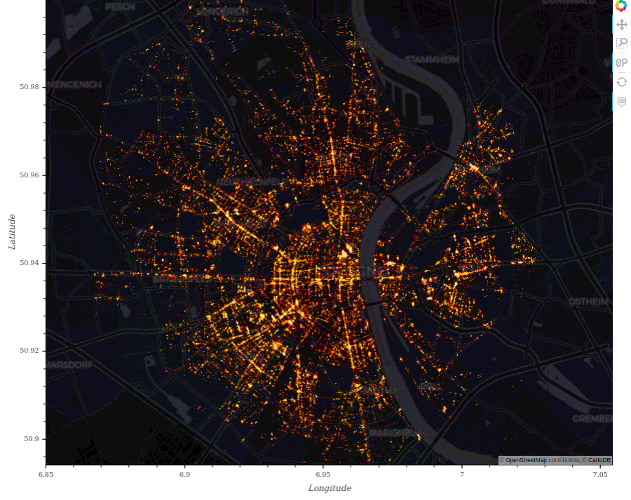
So we have about 1.5 million locations to deal with. How hard is it to plot all of them on a map of the city?
# Load districts as Polygons and Locations as Points and Overlay them on map
polys = gv.Polygons(districts, vdims=['district', 'area_km2'], crs=ccrs.PlateCarree())
points = gv.Points(df, ['lon', 'lat'], crs=ccrs.PlateCarree())

plot = gv.tile_sources.CartoDark()\
    * datashade(points, expand=False, height=2000, width=2000,
                cmap=fire, normalization='eq_hist')\
    * polys.opts(alpha=0.1, color='white', tools=['hover'])
plot.opts(width=700, height=600, bgcolor='black')
#gv.save(plot, "./img/datashader/map_cologne1.html")

Well, turns out the answer is: not very hard! We only need a few lines of code to process and plot all data points. Each pixel on the map represents the location of a bike at a certain time. You can clearly see patterns emerge. The main roads can be clearly identified as well as several points of interest like the university and the Cologne cathedral.