Interactive maps with Python made easy: Introducing Geoviews
Get this post as an interactive Jupyter Notebook and execute the code via Binder:
![]()
Motivation
Map visualizations are an effective way to gain insights from geo-spatial data. In a previous post we looked at rental bike data in Cologne. For that, we used the Basemap extension for Matplotlib. However, using Matplotlib often feels cumbersome and the output is static. Moreover, the charts look kind of outdated. In a follow up post we dealt with these issues by introducing bokeh as an alternative. The result was a good looking visualization with lots of interactivity.
However, when thinking about visualization libraries in Python the whole landscape is way wider:

While this means that there is tool for each need the bulk of options can also be overwhelming. This article deals with the problem and comes up with a great solution: the PyViz initiative which
“[…] [steers] users to a smaller number of starting points without cutting them off from important functionality […]”.
One of the results of the initiative is the GeoViews library:
GeoViews is a Python library that makes it easy to explore and visualize geographical, meteorological, and oceanographic datasets, such as those used in weather, climate, and remote sensing research.
It is very high-level so that you can do great things in only a few lines of code. Moreover, it builds upon bokeh so that you have interactivity. Lastly, it shares a consistent and simple syntax with all other PyViz libraries. In the following, we will again use our Cologne bike rental data to demonstrate the elegance of GeoViews. We will dive into using shapefiles, plotting geo locations and adding several levels of interactivity. Get the data here and follow along.
Setting up the environment
As usual, we start by importing the relevant libraries. Also, we tell GeoViews to use bokeh for chart outputs and display these inside our notebook:
# coding: utf-8
import pandas as pd
import numpy as np
import geoviews as gv
from bokeh.io import output_notebook
output_notebook()
pd.set_option('display.max_columns', 100)
gv.extension('bokeh')
Plotting districts
Now, we start by reading in a shapefile containing the borders of the districts of Cologne. You can get it here. For that, we use the geopandas library:
import geopandas as gpd

districts = gpd.read_file('./data/Stadtteil_WGS84.shp',
                         encoding='utf8')
districts['area_km2'] = districts['SHAPE_AREA'] / 1000 / 1000
districts.rename(columns={'STT_NAME': 'district'}, inplace=True)
districts.head()
| STT_NR | district | SHAPE_AREA | SHAPE_LEN | geometry | area_km2 | |
|---|---|---|---|---|---|---|
| 0 | 909 | Flittard | 7.735915e+06 | 14368.509990 | POLYGON ((7.013636806341599 51.02217143122909,... | 7.735915 |
| 1 | 905 | Dellbrück | 9.946585e+06 | 16722.887925 | POLYGON ((7.067466742735997 50.99362716308261,... | 9.946585 |
| 2 | 807 | Brück | 7.499469e+06 | 12759.921710 | POLYGON ((7.071040889038366 50.95452343845111,... | 7.499469 |
| 3 | 707 | Urbach | 2.291919e+06 | 7008.335906 | POLYGON ((7.091948656335505 50.88921847519149,... | 2.291919 |
| 4 | 501 | Nippes | 2.995158e+06 | 8434.060948 | POLYGON ((6.954707257821651 50.97357368526955,... | 2.995158 |
A geopandas dataframe is a regular pandas dataframe with additional geographic information. In this case, for each row it contains the Polygon which depicts the outline of the corresponding district. Moreover, we have the district’s name and the size of its area. Using this, we can now easily plot the districts on an interactive map of Cologne:
polys = gv.Polygons(districts, vdims=['district', 'area_km2'])
plot = gv.tile_sources.CartoLight()\
        * polys.opts(alpha=0.05, fill_alpha=0, tools=['hover'],
                     hover_fill_alpha=0.5, hover_fill_color='red')
plot.opts(width=500, height=400)
Wasn’t that easy? With only a few lines of code we get a lot:
- Detailed street map of the city
- Zoom functionality
- Move around
- Hover over each district and learn it’s name and area
Plotting bike locations
A convenient feature of GeoViews is overlaying. We can add several layers to our chart by simply using the * operator. Let’s read in our bike location data and add it to the map above:
# read in data from csv
df_all = pd.read_csv("./data/2018_bikes.csv", index_col='bike_id',
                     parse_dates=['scrape_datetime'])
df_all.shape
(1652552, 6)
# Get only a sample of the (large!) bike location data
df_small = df_all.sample(n=1000).sort_values(['scrape_datetime'])[['lat', 'lon', 'scrape_weekday']]
df_small.head(5)
| lat | lon | scrape_weekday | |
|---|---|---|---|
| bike_id | |||
| 21508 | 50.953769 | 6.891309 | Mon |
| 22059 | 50.927487 | 6.955318 | Mon |
| 21952 | 50.956044 | 6.886369 | Wed |
| 21901 | 50.925888 | 6.982437 | Wed |
| 21191 | 50.913515 | 6.922325 | Wed |
# Exclude location outliers
df_small = df_small[ abs(df_small['lat'] - df_small['lat'].median()) < 0.08]
df_small = df_small[ abs(df_small['lon'] - df_small['lon'].median()) < 0.08]
# Convert locations to points and overlay on previous map
points = gv.Points(df_small, kdims=['lon', 'lat'], vdims=['scrape_weekday'])
plot_points = plot * points.opts(alpha=0.3, color='red', size=4)
plot_points.opts(width=500, height=400)
Because the whole dataset is truly large (1.6 million) we restrict it to a smaller sample. Hence, we add 1.000 data points to our previous map. Even though this is a lot of data points the interactive map behaves pretty smoothly. GeoViews can easily deal with tens of thousands of points.Looking at the result, you already get a good idea about the distribution of bikes by zooming in and out and moving around the map.
Adding dimensions
As a last exercise, let’s use another great feature of GeoViews. You can add value dimensions to your data and group it accordingly. GeoViews automatically adds widgets to your plots allowing you to select between different values of your dimensions. Hence, exploring different parts of your data becomes straightforward. For example, we can check if there are distinctive patterns in the bike distribution between weekdays:
points_grouped = gv.Points(df_small, kdims=['lon', 'lat'], vdims=['scrape_weekday'])\
                   .groupby(['scrape_weekday'])
plot_grouped = plot * points_grouped.opts(alpha=0.5, color='red', size=5)
plot_grouped.opts(width=500, height=400)
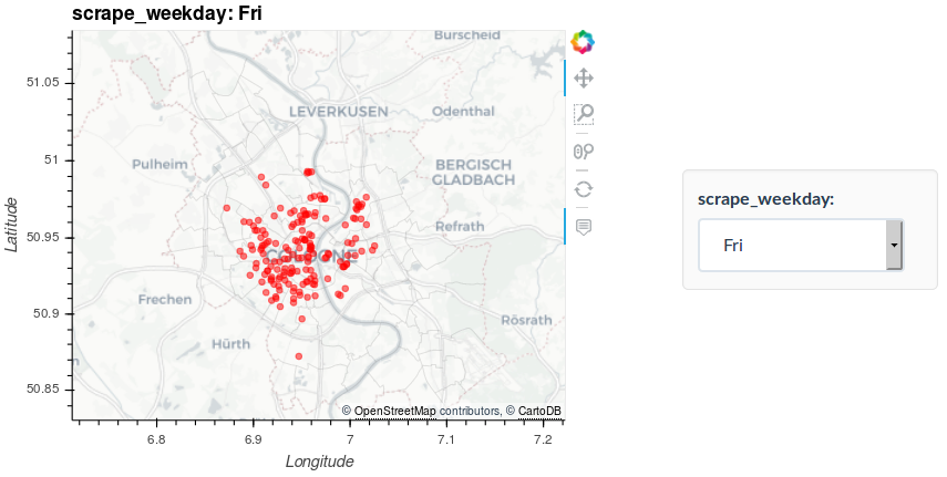
While we have only added a single dimension here you can add multiple to your visualization. This allows for a really thorough exploration of your geo spatial data.Moreover, we have only used a very limited fraction of the whole dataset to limit the file size. But GeoViews can deal with several tens of thousands data points without a problem. However, because the underlaying data has to be saved in the output file and processed by the browser there is a natural limit. But the PyViz / HoloViz ecosystem has a solution to that as well. With Datashader you can process and depict millions of data points without struggling. In a follow up post, I introduce this exciting tool by visualizing the complete (1.6M locations) bike dataset. The result will be an extremely detailed view on rental bike usage in Cologne in 2018!