Does Jameda discriminate against non-paying users? An explanatory data analysis
Background
Recently, I stumbled upon a very interesting article. It deals with the popular physicians platform Jameda. The platform lists almost all licensed physicians in Germany with a profile. Users can search for doctors and also review them. Because doctors can’t request to be removed from the platform, it has been the matter of numerous court decisions. Consequently, it has also received substantial media coverage.
But what made this specific article appeal to me is the promising example of data driven journalism. Its main statement is that the platform discriminates against non paying doctors by favoring premium profiles. This is not only a bold statement but also a consequential one. It is backed up with an analysis of the platform’s data. Immediately after reading the article I wanted to do the following:
1. Scrape the platform to get a dataset (more extensive and reliable than the article’s)
2. Check whether the claims are justified given the data
3. Investigate whether further insights can be gained
Consequently, this post describes how I approached these tasks and documents the results. For now, the focus will be on the latter two points as the first one is merely technical.
The Dataset
The data was scraped from the website of the platform, directly processed and stored in a SQL database. This turned out to be a much better choice than simply storing it as a .csv file (that’s what I’ve done in similar projects). It made coding the scraper more time consuming but simplified working with the data immensely. The data contains the complete profiles and review history of doctors in the five largest German cities. In each city an exhausting sample was collected that includes practitioners that fall into one of ten specializations. In total, the sample consists of 33.397 profiles. This is five times more than the data used in the original article (~6500). According to this official statistic there were 151.989 ambulant doctors in Germany in the year 2016. Hence, our sample covers about 22% of those. This proportion is even larger when looking at the specific specializations we have chosen. While the data has some biases, e.g. it ignores differences between rural and metropolitan doctors, I’d still argue that it pretty representative. Also, with this large number of observations we should be able to apply a wide range of statistical methods.
First things first: let’s setup our environment, read in the data from our SQL database into Pandas and get a first feel for it:
import MySQLdb
import sys
sys.path.append('../')
from sql_config import *  # Get SQL Credentials from Config

import numpy as np
import pandas as pd
pd.set_option('display.max_columns', 100)
pd.set_option('display.max_colwidth', 150)
import seaborn as sns
import matplotlib.pyplot as plt
%matplotlib inline
plt.style.use('ggplot')
plt.rcParams["figure.figsize"] = (10,8)
# Read data from SQL-Table to DataFrame
try:
    db = MySQLdb.connect(HOST, USER, PW, DB)
    cursor = db.cursor()
except Exception as e:
    log.exception("Couldn't connect to DB")
    db.close()

df = pd.read_sql('SELECT * FROM doc_list', con=db)
db.close()
The data structure is pretty clear. It is in long format, i.e. one row is one observation / one profile. The columns consist of all variables that could be scraped and I deemed to be interesting:
# Take a look at the structure: select a few random cases
# I drop columns containing personal data for privacy reasons
df.drop(["lastname", "street", "url_base"], axis=1).sample(n=6).head(6)
| id | user_id | firstname | male | city | area_code | is_reviewable | num_recommend | rate_recommend | num_reviews | fsid | grade | grade_treat | grade_explain | grade_trust | grade_timetaken | grade_friendly | num_grade_1 | num_grade_2 | num_grade_3 | num_grade_4 | num_grade_5 | num_grade_6 | check_rate | num_reviews_calc | top_badge | lat | lng | date_profile_update | num_visits | date_signup | premium | date_last_review | date_create | date_update | |
|---|---|---|---|---|---|---|---|---|---|---|---|---|---|---|---|---|---|---|---|---|---|---|---|---|---|---|---|---|---|---|---|---|---|---|---|
| 11006 | 11007 | 81304116 | Doris | Female | Berlin | 10707 | 1 | 2 | NaN | 1 | Pediatric | 1.00 | 1.0000 | 1.0000 | 1.0000 | 1.0000 | 1.0000 | 1.0 | NaN | NaN | NaN | NaN | NaN | 0.0 | 1.0 | NaN | 52.4998 | 13.31460 | 2013-03-20 | 4017.0 | NaT | None | 2017-04-12 06:17:39 | 2018-03-05 18:04:59 | 2018-03-05 20:46:09 |
| 1335 | 1336 | 80024611 | Jens-Harder | Male | Leverkusen | 51373 | 1 | 37 | 545.0 | 15 | General | 2.70 | 2.6667 | 2.8333 | 2.7500 | 2.9167 | 2.3333 | 9.0 | 1.0 | NaN | 1.0 | 4.0 | NaN | 0.0 | 12.0 | NaN | 51.0309 | 6.98487 | 2012-01-26 | 7315.0 | 2012-01-24 17:08:43 | Basic | 2018-02-23 11:32:01 | 2018-03-03 18:29:22 | 2018-03-05 15:18:21 |
| 12499 | 12500 | 80057242 | Dominik | Male | Berlin | 14169 | 1 | 89 | 636.0 | 13 | Orthopedist | 2.18 | 2.0909 | 2.2727 | 2.2727 | 2.1818 | 1.5455 | 10.0 | NaN | NaN | 3.0 | 1.0 | NaN | 53.0 | 11.0 | NaN | 52.4379 | 13.26240 | 2012-02-22 | 12362.0 | NaT | None | 2018-02-25 19:22:40 | 2018-03-05 18:07:51 | 2018-03-05 21:03:12 |
| 32668 | 32669 | 80047125 | Horst | Male | Frankfurt | 60322 | 1 | 14 | 667.0 | 5 | Dentist | 1.60 | 2.0000 | 1.4000 | 2.0000 | 1.4000 | 1.2000 | 4.0 | NaN | 1.0 | NaN | NaN | NaN | 0.0 | 5.0 | NaN | 50.1209 | 8.67416 | 2009-06-03 | 2146.0 | NaT | None | 2017-09-01 22:01:16 | 2018-03-05 18:55:01 | 2018-03-06 00:54:35 |
| 5712 | 5713 | 81207126 | Nathalie | Female | Köln | 50937 | 1 | 29 | 857.0 | 26 | Dentist | 1.24 | 1.2727 | 1.1364 | 1.2727 | 1.3182 | 1.1818 | 22.0 | 1.0 | 2.0 | NaN | 1.0 | NaN | 0.0 | 22.0 | NaN | 50.9245 | 6.92687 | 2011-02-03 | 4350.0 | NaT | None | 2017-09-25 14:00:02 | 2018-03-03 18:42:51 | 2018-03-05 16:11:37 |
| 2188 | 2189 | 80059194 | Lothar | Male | Köln | 50931 | 1 | 36 | 500.0 | 10 | Dermatologist | 2.00 | 2.4286 | 2.4286 | 2.1429 | 1.8571 | 1.1429 | 7.0 | NaN | NaN | 3.0 | NaN | NaN | 0.0 | 7.0 | NaN | 50.9307 | 6.91607 | 2014-05-06 | 12812.0 | NaT | None | 2017-04-24 11:54:19 | 2018-03-03 18:31:59 | 2018-03-05 15:27:51 |
Most variable names should be self explanatory. When reviewing a doctor users can grade him on five different aspects. The total grade is the average of those. Doctors in the top10 of their specialization and area receive a top_bage which is displayed on their profile. The number of total reviews can be found in num_reviews and also includes archived reviews that don’t go into the total grade calculation. In contrast, num_reviews_calc includes only reviews that count towards the grade. The column fsid contains a doctor’s specialization (one of the ten we selected). Doctors can have a premium account for which they pay a monthly fee. This Gold account allows doctors to add a picture and extensive information to their profiles. Additionally, they are displayed more prominently throughout the site and ranked higher in search queries. In contrast, users with a Basic account are non-paying. They can only edit basic information and miss out on further advantages. However, both paying and non-paying users share an important feature: they get notified about new reviews and, more importantly, can report unwanted ones. In comparison, users without an account (None) are completely uninvolved in their profile. I assume, that in quite a few cases they won’t even know that they are listed (or know about this “novelty called the Internet” 😁). Lastly, we have the coordinates (lat, lng) of each physicians location.
Before we start to dive into the data, we have to do some cleaning and preparing. Fortunately, there will not be much to do. This is why storing the data in SQL was such a good choice: it is not only already structured very well but a lot of manipulations can be completed in SQL. This is way faster and easier (well, sometimes at least …). So, let’s see what remains to be done:
# Create categoricals and define their manifestations
df.loc[df.premium == 4, 'premium'] = 0 # Only two cases. Outdated premium-package, i.e. "Silver"?
df.premium.fillna(0, inplace=True)
df["premium"] = df["premium"].astype("category")
df.premium.cat.categories = ["None", "Basic", "Gold", "Platinum"]

df["fsid"] = df["fsid"].astype("category")
df.fsid.cat.categories = ["Pediatric", "Orthopedist", "Urologist", "Dentist", "General",
                          "Oculist", "Gynecologist", "Dermatologist", "ENT", "Internist"]

df["male"] = df["male"].astype("category")
df.male.cat.categories = ['Male', 'Female']
That wasn’t too much. So, for starters let’s get an idea about how the sample can be divided in categories:
print("Number of profiles by sex: ", df.groupby("male").size())
print("Male to female ratio: %s" % ( len(df.groupby("male").get_group("Male"))
                                    / len(df.groupby("male").get_group("Female"))))
Number of profiles by sex:  male
Male      18554
Female    14843
dtype: int64
Male to female ratio: 1.2500168429562757
There are 25% more males in the data. Again, we can compare this to the official number. With 27% this is only slightly higher. Again, this indicates that our sample comes very close to the true distribution. The difference is probably due to having excluded specializations that are male dominant in our set. For example, our sample does not include surgeons. That’s a subject with four times more males! Speaking of subjects, we’ll now visualize them in our data:
ax = sns.countplot(x="fsid", hue="male", data=df)
ax.set_title("Doctors by gender and specialization")
ax.set_xlabel("Specialization")
plt.xticks(rotation=45)
print("Number of profiles by doctor specialization:", df.groupby("fsid").size())
Number of profiles by doctor specialization: fsid
Pediatric         3057
Orthopedist       2628
Urologist         1106
Dentist           7803
General          10316
Oculist           1541
Gynecologist      2897
Dermatologist     1444
ENT               1444
Internist         1161
dtype: int64
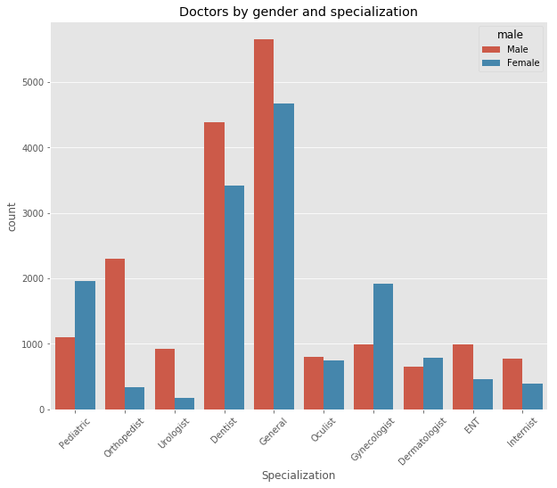
General practitioners and dentists are by far the most common doctors in our sample. No surprise there. However, this chart also tells a more interesting story. We see that specialization preferences vary greatly between genders. Some fields have a gender proportion reflecting the overall distribution, e.g. dentists and general practitioners. In contrast, ENT doctors, urologists and especially orthopedists are mostly male while pediatricians, dermatologists and gynecologists are mostly female.
Next, we look at the account types, i.e. if doctors have a (non-)paying account on the site or not:
ax = sns.countplot(x="premium", hue="male", data=df)
ax.set_title("User types by gender")
ax.set_xlabel("account type")
print("Profiles by user type (in %):",
      df.groupby("premium").size().apply(lambda x:  x * 100 / len(df) ))
Profiles by user type (in %): premium
None     77.168608
Basic    13.872504
Gold      8.958889
dtype: float64
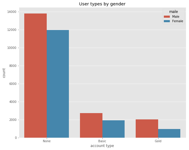
Most listed doctors (77%) don’t have an account on the site. The 14% of basic users have a free account and the 8% (1%) of gold (platinum) users have a paying one. Again, we observe differences between sexes. The male to female ratio for non users and basic users is pretty similar. It corresponds to the general gender proportion in the dataset. However, there are almost twice as many male premium users. We follow up by looking at some of the interesting outcome variables. Those are the number of visits on each profile and the number and average of recommendations and reviews. We start by visualizing their distribution:
# Remove two huge outliers.
df.loc[ df.num_visits > 300000, 'num_visits'] = np.nan
# Plot hisogram and define appearance
ax = df.num_visits.hist(bins=1000)
ax.set_title("Number of profile visits")
ax.set_xlabel("Visits")
ax.set_ylabel("Profiles")
ax.set_xlim(0, df.num_visits.mean()*5)
# Add Mean-Line
plt.axvline(df.num_visits.mean(), color='r', linestyle='dashed', linewidth=2)
print("Average number of visits on profile:", df.num_visits.mean())
Average number of visits on profile: 7043.402305734391
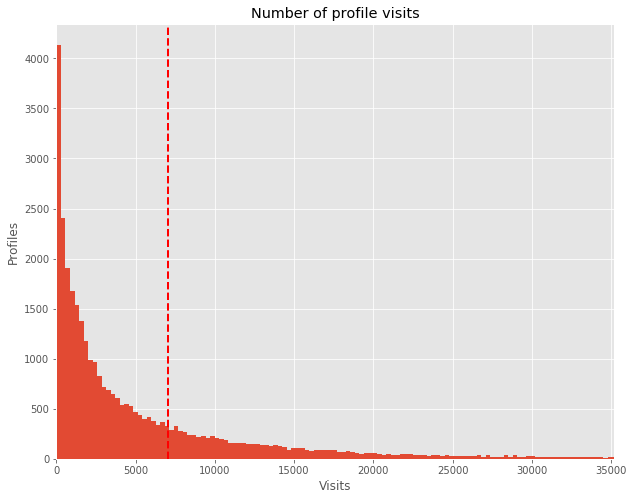
This chart resembles a truncated normal distribution almost perfectly: we have a majority of profiles with very few visits and very few with a lot of visits. Depicting the number of recommendations and reviews shows a very similar picture (thus, skipped here). This kind of distribution is exactly what you would expect beforehand. Hence, it indicates that the data at hand is of high quality and there are no abnormalities.
Descriptive Statistics
Up to here, everything in our data is in a good shape. Hence, we can start to look for patterns. For that, we visualize the relevant numeric variables first. Using a correlation matrix plot we can quickly detect relationships between them:
correlations = df[['grade','num_recommend','rate_recommend','num_reviews',
                   'check_rate', 'num_visits']].corr()
plt.matshow(correlations, vmin=-1, vmax=1, cmap=plt.get_cmap('seismic'))
plt.xticks(range(len(correlations)), correlations)
plt.yticks(range(len(correlations)), correlations)
plt.xticks(rotation=45)
plt.colorbar()
correlations
| grade | num_recommend | rate_recommend | num_reviews | check_rate | num_visits | |
|---|---|---|---|---|---|---|
| grade | 1.000000 | -0.071883 | -0.796749 | -0.050142 | -0.051967 | -0.027902 |
| num_recommend | -0.071883 | 1.000000 | 0.132204 | 0.659218 | 0.138951 | 0.648302 |
| rate_recommend | -0.796749 | 0.132204 | 1.000000 | 0.139199 | 0.081244 | 0.090160 |
| num_reviews | -0.050142 | 0.659218 | 0.139199 | 1.000000 | 0.148478 | 0.769205 |
| check_rate | -0.051967 | 0.138951 | 0.081244 | 0.148478 | 1.000000 | 0.103873 |
| num_visits | -0.027902 | 0.648302 | 0.090160 | 0.769205 | 0.103873 | 1.000000 |
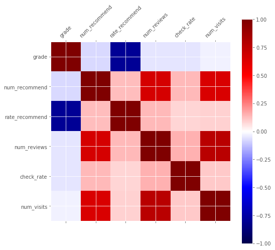
We learn that the highest correlation is between the average grade and the rate of recommendations. The grading system on the site is identical to that in German schools. The best rating is 1 and the worst 6. This explains why the correlation is negative. This result is intuitive because both variables are an expression for sympathy. But besides that, other factors don’t seem to have a meaningful influence on the grading. A second result is that the number of visits, recommendations and reviews are positively correlated. Naturally, that doesn’t surprise us.
Before, we looked at the sample distribution according to some categories, i.e. sex, specialization and account type. Next, we investigate whether there are any differences in the outcome variables between these same categories. A difference in some of the outcomes between different account types would be a first clue that discrimination or nepotism could be in play. Our first look is directed at the distribution of review grades:
# Merge Gold and Platinum categories - anyway essentially the same
df.loc[ df.premium == 'Platinum' ,'premium'] = 'Gold'
df.premium.cat.remove_categories(removals='Platinum', inplace=True)
# for plot.bar() to directly work on the groupby, change from wide to long format (transpose)
grade_dist= ['num_grade_1','num_grade_2', 'num_grade_3', 'num_grade_4',
             'num_grade_5', 'num_grade_6' ]
grade_dist_premium = df.groupby("premium")[grade_dist].\
                        sum().transpose().apply(lambda x: x * 100 / x.sum())
grade_dist_premium
| premium | None | Basic | Gold |
|---|---|---|---|
| num_grade_1 | 74.944096 | 84.845189 | 94.419136 |
| num_grade_2 | 4.101907 | 3.168733 | 1.826418 |
| num_grade_3 | 3.354218 | 2.404950 | 1.027096 |
| num_grade_4 | 5.757901 | 3.565127 | 1.222693 |
| num_grade_5 | 8.125584 | 4.441302 | 1.188823 |
| num_grade_6 | 3.716293 | 1.574698 | 0.315834 |
# Grouped bar plot with annotations above the bars
ax = grade_dist_premium.plot.bar()
ax.set_title("Distribution of grades by account type")
ax.set_yticks(range(0, 100, 10))
ax.set_xlabel("Grade")
ax.set_xticklabels(range(1,7))
# Add percentages above the bar as labels
# iterate through each row first than each column
k = -1
for j, i in enumerate(ax.patches):
    if j % len(grade_dist_premium) == 0: k+=1
    ax.text(i.get_x(), i.get_height() + 5,
            str(int(round(grade_dist_premium.iloc[j
                          % len(grade_dist_premium), k], 0)))+"%",
            fontsize=13, rotation=45)
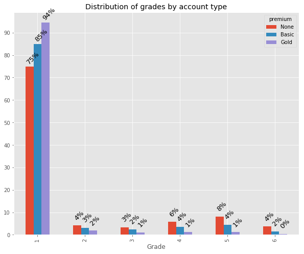
Altogether the awarded grades are very high. Clearly, there is a difference in the average grades between non-users, basic and premium users. The latter receiving a whooping 95% rate of top ratings. Additionally, for non-paying users grades follow a distribution very common in online review scenarios, e.g. on Amazon: there are many top, very few medium and a bunch of poor ratings. This is because writing a review is costly (not to mention that it is also irrational for an individual). Thus, for most people only a very pleasant or painful experience outweighs this cost and is followed up with a review. For users without an account this pattern is most pronounced. However, it is mitigated with the level of engagement. While for basic users it is still vaguely perceptible it has vanished for premium accounts. We can compare our distribution to the original article:
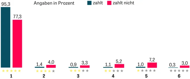
The article didn’t differentiate between non-users and basic users. They were both categorized as “zahlt nicht” (non-paying). As it turns out, this is a shortcoming because we have already seen that there are significant differences here. Other than that, the results are strikingly similar to ours. We can also compare the average grades between the two datasets. The article’s author states that they found an average rating of 1.2 (paying) and 1.7 (non paying). We can easily compare this:
# Descriptive statistics by account type
df.groupby("premium")['grade','num_recommend','rate_recommend','num_reviews',
                      'check_rate', 'num_visits'].describe()
| grade | num_recommend | rate_recommend | num_reviews | check_rate | num_visits | |||||||||||||||||||||||||||||||||||||||||||
|---|---|---|---|---|---|---|---|---|---|---|---|---|---|---|---|---|---|---|---|---|---|---|---|---|---|---|---|---|---|---|---|---|---|---|---|---|---|---|---|---|---|---|---|---|---|---|---|---|
| count | mean | std | min | 25% | 50% | 75% | max | count | mean | std | min | 25% | 50% | 75% | max | count | mean | std | min | 25% | 50% | 75% | max | count | mean | std | min | 25% | 50% | 75% | max | count | mean | std | min | 25% | 50% | 75% | max | count | mean | std | min | 25% | 50% | 75% | max | |
| premium | ||||||||||||||||||||||||||||||||||||||||||||||||
| None | 14558.0 | 1.759344 | 0.974262 | 1.0 | 1.00 | 1.33 | 2.20 | 6.0 | 25772.0 | 22.632857 | 51.906637 | 0.0 | 1.0 | 10.0 | 28.0 | 2691.0 | 11869.0 | 685.613615 | 289.012767 | 0.0 | 500.00 | 739.0 | 1000.0 | 1000.0 | 25772.0 | 5.811074 | 10.418519 | 0.0 | 0.0 | 2.0 | 8.0 | 362.0 | 15364.0 | 35.566454 | 95.188336 | 0.0 | 0.0 | 0.0 | 29.0 | 1000.0 | 25771.0 | 4397.805518 | 7047.119769 | 30.0 | 601.5 | 1932.0 | 5380.5 | 144406.0 |
| Basic | 4194.0 | 1.518808 | 0.652497 | 1.0 | 1.04 | 1.26 | 1.77 | 6.0 | 4633.0 | 63.290956 | 119.201184 | 0.0 | 18.0 | 37.0 | 72.0 | 3213.0 | 3923.0 | 790.077492 | 218.691776 | 0.0 | 667.00 | 844.0 | 1000.0 | 1000.0 | 4633.0 | 19.364127 | 28.197608 | 0.0 | 5.0 | 12.0 | 23.0 | 652.0 | 4291.0 | 60.019343 | 94.885945 | 0.0 | 0.0 | 31.0 | 88.0 | 1000.0 | 4633.0 | 11029.475070 | 14209.965593 | 41.0 | 2916.0 | 6641.0 | 13660.0 | 176359.0 |
| Gold | 2911.0 | 1.213799 | 0.320548 | 1.0 | 1.03 | 1.09 | 1.26 | 4.0 | 2992.0 | 130.269051 | 212.393085 | 0.0 | 30.0 | 66.0 | 145.0 | 3150.0 | 2800.0 | 906.985714 | 131.142466 | 0.0 | 870.75 | 957.0 | 1000.0 | 1000.0 | 2992.0 | 51.124666 | 64.314211 | 0.0 | 12.0 | 29.0 | 63.0 | 640.0 | 2922.0 | 86.709788 | 92.822219 | 0.0 | 23.0 | 69.0 | 118.0 | 1000.0 | 2991.0 | 23663.997325 | 31969.525033 | 1.0 | 4742.5 | 12550.0 | 29477.0 | 285063.0 |
Again, the numbers fit almost perfectly. We find average ratings of 1.76 for non, 1.52 for basic and 1.21 for premium users. This is assuring as we can expect to be looking at very similar datasets! By looking at the quartiles and the standard deviation we learn that ratings for premium users are much more consistent. Only one third of gold members have a rating worse than 1.26. Moreover, compared to basic users they also receive more than twice the number of recommendations, ratings and visits. In comparison to non-users the differences are even higher. These discrepancies in distribution and mean of the ratings are a crucial finding. The Zeit article uses them to argue that premium users are favored. We will verify this claim in more detail later. But what about rating differences between the other categories? Let’s investigate further by visualizing average grades by gender and specialization:
ax = sns.barplot(x="fsid", y="grade", hue="male", data=df);
ax.set_title("Average ratings by gender and specialization")
ax.set_xlabel("Specialization")
plt.xticks(rotation=45)
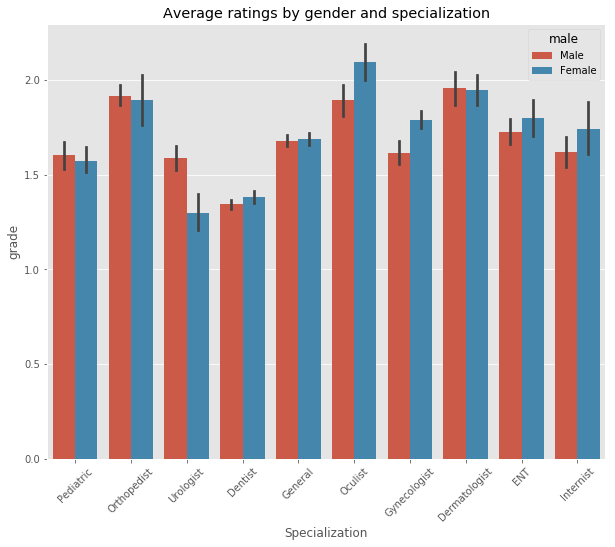
Dentists, Pediatrics and Urologists receive the best ratings. Orthopedists, Dermatologists and Oculists the worst. In general, male doctors receive slightly better ratings, however, in most cases the difference is not statistically significant (indicated by the depicted confidence intervals). Interestingly, female Urologists and male Gynecologists are graded significantly better than their counterparts.
Geo spatial distribution of physicians
Until now, we have not considered the location data of each physician’s practice. After all, it seems unlikely (but not ruled out!) that it has a crucial effect on ratings. However, the locations combined with other variables might exhibit interesting patterns. So, as a last exercise in our exploratory analysis we’ll visualize them. For that, we will use the amazing bokeh library. I’ve already written about its basic and advanced interactivity.
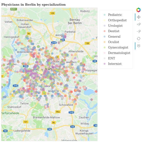
To be able to go into the details we restrict ourselves to the city with the most observations in our dataset, Berlin. We draw a circle for each physician on a Google map of the city. The appearance of the circle can be used to represent an additional dimension. Let’s use the physicians’ specialization:
from bokeh.plotting import output_notebook, show, reset_output, figure, output_file
from bokeh.io import export_png
from bokeh.transform import factor_cmap, log_cmap
from bokeh.palettes import Set3, RdYlGn, Spectral
from bokeh.models import (
  GMapPlot, GMapOptions, ColumnDataSource, Circle, Range1d, PanTool,
  ResetTool, HoverTool, ZoomInTool, ZoomOutTool, Legend,
  LogColorMapper, ColorBar
)
reset_output()
# Select a random fraction of cases in Berlin and exclude a mislabled case
df_berlin = df[(df.city=="Berlin") & (df.lat>52)].sample(frac=0.3)
# define a list of colors from the bokeh Set3 palette
my_palette = Set3[10]

# Set google map options to a  section of Berlin
map_options = GMapOptions(lat=52.5, lng=13.42, map_type="roadmap", zoom=10)
p = GMapPlot(x_range=Range1d(), y_range=Range1d(), map_options=map_options)
p.title.text = "Physicians in Berlin by specialization"
p.api_key = "AIzaSyD7N9_DJeYhE2BsGU7VYbzSM2j81WlPtdU"

legend_it = []
# draw all locations per fsid/specialization one by one
for i, subject in enumerate(df_berlin.fsid.cat.categories):
    source = ColumnDataSource(df_berlin[df.fsid == subject] )
    circle = Circle (x="lng", y="lat", line_color=None, fill_alpha=0.5,
                     fill_color=my_palette[i], size=10)
    glyph = p.add_glyph(source, circle)
    legend_it.append((subject, [glyph]))

# Create Toolbar and legend
p.add_tools(PanTool(), HoverTool(), ZoomInTool(), ZoomOutTool(), ResetTool() )
legend = Legend(items=legend_it)
p.add_layout(legend, 'right')

# Configure output when hovering over points
hover = p.select_one(HoverTool)
hover.tooltips = [("Subject", "@fsid"),("Rating", "@grade"),
                  ("Street", "@street")]

export_png(p, filename="jameda_berlin_basic.png")
output_file("jameda_berlin_basic.html")
show(p)
Here is the result (click for the interactive version):
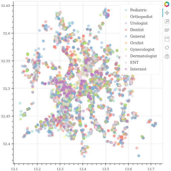
While the result looks pretty nice it is hard to notice relevant patterns. Even though we plot only part of all locations it is still too crowded. We’ll try to increase the clarity next. For that, we will make it possible to toggle which categories are displayed. In that way, it becomes possible to inspect the categories one by one or to compare only a selected few with each other:
df_berlin = df[(df.city=="Berlin") & (df.lat>52)]
my_palette = Set3[10] # define a list of colors

# use a clean figure instead of the google map
p = figure(plot_width=600, plot_height=600)

# draw all locations per fsid/specialization one by one
for i, subject in enumerate(df_berlin.fsid.cat.categories):
    source = ColumnDataSource(df_berlin[df.fsid == subject] )
    p.circle(x="lng", y="lat", line_color=None, fill_color=my_palette[i],
             fill_alpha = 0.5, size=10, legend=subject, source=source)

p.legend.location = "top_right"
p.legend.click_policy="hide"

export_png(p, filename="jameda_berlin_toggle.png")
output_file("jameda_berlin_toggle.html")
show(p)
Click for the interactive result (it’s a big file). You can click on legend items to toggle their visibility:
Now, clicking on an item in the legend will toggle its visibility. This makes the picture much easier to comprehend. Thus, it’s simple to come to a conclusion: There is only one slightly remarkable finding. Internists have a high concentration on the south-west to north-east axis. But there are almost none in the south-west of the city. Other than that, there is not too much to take away from this visualization 😝. This is also the case when doing the same exercise for account type and average rating (hence, omitted here). Nonetheless, in spite of not finding any additional patterns this is a good showcase for the capabilities of bokeh!
A model explaining rating differences
With the help of descriptive statistics we have revealed some compelling patterns. As already mentioned, our focus are rating differences. In accordance with the Zeit article we have found substantial differences between free and paying users. Based on that, the author claims that “having a premium account pays out”. At first, this seems appropriate. But at second, recall that other factors can influence ratings as well. Hence, simple correlations might not tell the whole story. We have to additionally control for confounding factors.
Consequently, we go beyond the original authors work to explain the differences. We can do so by constructing a regression model. This will allow us to identify the influence of specific factors while controlling for others. For this, we will be using the statsmodels package. I prefer it in this case because it prints a pretty output of the model summary. So, let’s do a regression of the grade on some explanatory variables:
import statsmodels.api as sm
# Prepare y = dependent variable and  x = independent variables
y = df[['grade']]
x = df[['num_recommend', 'num_reviews', 'check_rate', 'num_visits'] ]
# Create dummy variables from categoricals and add them as columns
x = pd.concat([x, pd.get_dummies(df.premium, drop_first=True, prefix="dummy_"),
               pd.get_dummies(df.male, drop_first=True, prefix="dummy_"),
               pd.get_dummies(df.fsid, drop_first=True, prefix="dummy_")],
               axis=1)
x.head(5)
| num_recommend | num_reviews | check_rate | num_visits | dummy__Basic | dummy__Gold | dummy__Female | dummy__Orthopedist | dummy__Urologist | dummy__Dentist | dummy__General | dummy__Oculist | dummy__Gynecologist | dummy__Dermatologist | dummy__ENT | dummy__Internist | |
|---|---|---|---|---|---|---|---|---|---|---|---|---|---|---|---|---|
| 0 | 0 | 0 | NaN | 867.0 | 0 | 0 | 1 | 0 | 0 | 0 | 1 | 0 | 0 | 0 | 0 | 0 |
| 1 | 85 | 32 | 56.0 | 24738.0 | 0 | 1 | 0 | 0 | 0 | 0 | 1 | 0 | 0 | 0 | 0 | 0 |
| 2 | 18 | 12 | 0.0 | 5484.0 | 1 | 0 | 0 | 0 | 0 | 0 | 1 | 0 | 0 | 0 | 0 | 0 |
| 3 | 39 | 13 | 0.0 | 7644.0 | 0 | 0 | 1 | 0 | 0 | 0 | 1 | 0 | 0 | 0 | 0 | 0 |
| 4 | 4 | 0 | NaN | 842.0 | 1 | 0 | 1 | 0 | 0 | 0 | 1 | 0 | 0 | 0 | 0 | 0 |
# Fit the model with ordinary least square and show summary
model = sm.OLS(y, sm.add_constant(x), missing='drop').fit()
model.summary()
| Dep. Variable: | grade | R-squared: | 0.101 |
|---|---|---|---|
| Model: | OLS | Adj. R-squared: | 0.101 |
| Method: | Least Squares | F-statistic: | 152.3 |
| Date: | Fri, 30 Mar 2018 | Prob (F-statistic): | 0.00 |
| Time: | 16:55:47 | Log-Likelihood: | -26762. |
| No. Observations: | 21660 | AIC: | 5.356e+04 |
| Df Residuals: | 21643 | BIC: | 5.369e+04 |
| Df Model: | 16 | ||
| Covariance Type: | nonrobust |
| coef | std err | t | P>|t| | [0.025 | 0.975] | |
|---|---|---|---|---|---|---|
| const | 1.7148 | 0.026 | 66.403 | 0.000 | 1.664 | 1.765 |
| num_recommend | -0.0006 | 6.78e-05 | -8.316 | 0.000 | -0.001 | -0.000 |
| num_reviews | 0.0024 | 0.000 | 7.938 | 0.000 | 0.002 | 0.003 |
| check_rate | 8.876e-05 | 6.96e-05 | 1.275 | 0.202 | -4.76e-05 | 0.000 |
| num_visits | -2.108e-06 | 5.83e-07 | -3.612 | 0.000 | -3.25e-06 | -9.64e-07 |
| dummy__Basic | -0.2553 | 0.015 | -17.140 | 0.000 | -0.284 | -0.226 |
| dummy__Gold | -0.5434 | 0.019 | -27.891 | 0.000 | -0.582 | -0.505 |
| dummy__Female | 0.0010 | 0.012 | 0.083 | 0.934 | -0.023 | 0.025 |
| dummy__Orthopedist | 0.3817 | 0.032 | 11.745 | 0.000 | 0.318 | 0.445 |
| dummy__Urologist | 0.0090 | 0.040 | 0.225 | 0.822 | -0.070 | 0.088 |
| dummy__Dentist | -0.2055 | 0.027 | -7.711 | 0.000 | -0.258 | -0.153 |
| dummy__General | 0.0469 | 0.026 | 1.780 | 0.075 | -0.005 | 0.099 |
| dummy__Oculist | 0.4039 | 0.035 | 11.471 | 0.000 | 0.335 | 0.473 |
| dummy__Gynecologist | 0.1296 | 0.031 | 4.214 | 0.000 | 0.069 | 0.190 |
| dummy__Dermatologist | 0.4397 | 0.036 | 12.188 | 0.000 | 0.369 | 0.510 |
| dummy__ENT | 0.1832 | 0.036 | 5.105 | 0.000 | 0.113 | 0.254 |
| dummy__Internist | 0.0595 | 0.042 | 1.434 | 0.152 | -0.022 | 0.141 |
| Omnibus: | 7852.170 | Durbin-Watson: | 1.864 |
|---|---|---|---|
| Prob(Omnibus): | 0.000 | Jarque-Bera (JB): | 29092.854 |
| Skew: | 1.818 | Prob(JB): | 0.00 |
| Kurtosis: | 7.360 | Cond. No. | 2.73e+05 |
There are lots of interesting results here. Due to the numerous observations most coefficients are highly significant. The main findings are:
- We cannot conclude that females are rated any different than males
- Our former findings regarding the ratings by specialization are confirmed
- There is a small but significant negative effect of the number of reviews on the rating. Given that we control for the number of visits this could mean that unsatisfied patients are more likely to submit a review
- Having an account on the site is associated with better grades. The average Gold member’s grade is about 0,54 better compared to a non-member. That’s a substantial difference!
The last point is also the most relevant one. It supports our former suspicion and the claim of the article: paying doctors seem to have a significant advantage in terms of ratings over non-paying doctors. However, the Zeit article (in my opinion) prematurely gives the impression that this is a causal relationship: because doctors pay for an account they get better grades. But statistics only tell us about correlation not about causality. Any claim of causality must be based on a theoretical foundation and tested experimentally. But there is not a single theory in this case. For example, a likely scenario could be this: doctors who treat their patients exceptionally well also care a lot about their reputation online. Thus, they are more likely to invest time and money in their profile. In result, there will be relatively more doctors with paying accounts that receive top ratings.
Nonetheless, the original author brings forward a suspicion that could credibly support his claim. It is based on the observation that paying members have almost no poor ratings. He states that this could be due to premium members reporting relatively more negative reviews. Paying for an account already shows that a doctor probably cares about his profile more than others. Thus, it seems believable that he will also be more concerned about negative reviews. Assuming that at least some of the reported reviews are removed this sound like a reasonable explanation.
The author wanted to verify this theory. He asked Jameda whether there are differences in the number of removed reviews between paying and non-paying doctors. Unsurprisingly, Jameda claims that they don’t have this data. Surprisingly, I do have data on this. Therefore, in a follow up post we will investigate which theory is most likely true based on the actual data. Stay tuned!
