Choropleth Maps with bokeh: visualizing changes over time
In the last post we built a basic choropleth map with bokeh. To do so, we used the Cologne bike rental data gathered in a previous post. We depicted the density of rental bikes per district by coloring each district accordingly. Above that, the map had a first interactive element: It displayed the density measure when hovering over the neighborhoods.
Now, we will improve on our example. The goal is to visualize how the density of bikes per district changes over the course of a day. Consequently, we will need to make our static choropleth map dynamic. For this, we will add a slider to the map which controls the underlying data. Moving the slider allows to look at our measure at different points in time. Additionally, we will implement the change over time as an animation. Fortunately, bokeh is up to the task. The result will be a stand-alone .html file which can easily be deployed online.
You can find the complete code on github. It builds on the code we used previously. Hence, I will only comment on the relevant changes.
UPDATE: You can find data similar to the one used in this article here. Because it is slightly different you will have do adapt the read_data function below.
Adjusting the data structure
Before, we only used the first 1000 rows of the dataset. This was sufficient for our static map. After all, we were only looking at a single point in time. Now, we want to see how the distribution of bikes changes over time. Hence, we will need data including at least a whole day of bike location information:
data = read_data("~/kvb/data/2017-03-01.csv")
# create dataset with only one observation per hour
time = pd.DatetimeIndex(data.scrape_time)
data_hourly = data[time.minute < 1] # first obsv for each hour
time = pd.DatetimeIndex(data_hourly.scrape_time)
data_hourly['hour'] = time.hour
periods = len(data_hourly[
            data_hourly.duplicated(subset='hour') == False])# number of obsv.
The dataset we read in contains information on bike locations for every few minutes. This is clearly too granular to contain significant changes between periods. Thus, we restrict it to one observation per hour. We achieve this by selecting all data points retrieved in the first minute of each hour. Additionally, we add a new column to the data (hour) containing a single number for the respective hour. Following, we convert the bike locations to shapely points. Unlike before, we have to account for the time the bike locations were observed at:
# list of lists - one sublist per period
map_points = []
all_points = []
for i in range(periods):
    map_points.append(list())
    all_points.append(list())
    map_points[i] = [Point(x,y) for x,y in
                        zip(data_hourly[data_hourly.hour == i].lon,
                        data_hourly[data_hourly.hour == i].lat)] # Points to Shapely Pts
    all_points[i] = MultiPoint(map_points[i]) # all bike points
The result is a list of lists. The index i in map_points[i] stands for the hour of the observation. Then, we extract the features from the shapefile. No need for adjustments here. In contrast, the computation of number of bikes per district has to be slightly adapted. We account for the observation time analogously:
num_bikes = []
bikes_per_area = []
for i in range(periods):
    num_bikes.append(list())
    bikes_per_area.append(list())
    num_bikes[i] = [ calc_points_per_poly(poly, all_points[i]) for poly in district_poly]
    bikes_per_area[i] = [  x/y*10000 for x,y in zip(num_bikes[i], district_area)]
Setting the data source of the plot
Next, comes the essential part with regards to bokeh. We start modifying the dictionary holding the data which will be used as the map’s source:
# Prepare data source for plot
rate_hours = {str(i): v for i, v
                in enumerate(bikes_per_area)} # from list to dict
data = dict(x=district_x, y=district_y, name=district_name,
            rate=bikes_per_area[0], **rate_hours) # merge dicts
source = ColumnDataSource(data) # one col per obsv. period
We convert the list of lists containing our bikes per area to a dictionary named rate_hours. As before, it contains the measure which will define how to color the different districts. The name of the dictionary keys will be the hours of the day for the observation. For example, rate_hours['10'] contains the density measure for each district as observed at 10 p.m. Our aim is to be able to switch between these different measures. Therefore, we need to pass them as a source to the ColumnDataSource function of bokeh. We do this after combining them with the data on district boundaries and their names. The definition of the plot stays the same:
# prepare plotting with bokeh
custom_colors = ['#f2f2f2', '#fee5d9', '#fcbba1', '#fc9272', '#fb6a4a', '#de2d26']
color_mapper = LogColorMapper(palette=custom_colors)
TOOLS = "pan,wheel_zoom,reset,hover,save"
p = figure(
    title="Change in bike density per district over time, Mar. 2017", tools=TOOLS,
    x_axis_location=None, y_axis_location=None
)
p.grid.grid_line_color = None
p.patches('x', 'y', source=source,
            fill_color={'field': 'rate', 'transform': color_mapper},
fill_alpha=0.8, line_color="black", line_width=0.3)
At this point the map is ready to be plotted. However, it is still static. The patches will be plotted with the color defined by the measure in source.data['rate']. In the following section we add the dynamic aspect.
Switching between data sources
The only thing still missing is the functionality to switch between the different measures defining the fill_color of the patches / districts. We already made the data for that available in the source. Now, we need to add the ability to switch between it. For this, we will add a slider controlling the underlying data. So let’s tackle this:
from bokeh.layouts import column, row, widgetbox
from bokeh.models import CustomJS, Slider, Toggle

output_file("kvb_dynamic_interactive.html")

# add slider with callback to update data source
slider = Slider(start=0, end=23, value=0, step=1, title="Hour of day")

def update(source=source, slider=slider, window=None):
    """ Update the map: change the bike density measure according to slider
        will be translated to JavaScript and Called in Browser """
    data = source.data
    v = cb_obj.get('value')
    data['rate'] = [x for x in data[v]]
    source.trigger('change')

slider.js_on_change('value', CustomJS.from_py_func(update))
show(column(p,widgetbox(slider),))
For understanding this code I suggest you also read the bokeh documentation on JavaScript Callbacks. First, a slider widget is added. It lets you select a number between 0 and 23 (think: hours of the day). Second, with js_on_change we define a callback function for the slider. Consequently, whenever the slider is moved the update function is called. This is where the crucial step happens: the original data['rate'] values are overwritten with values from data['v'] where v is the slider’s current value. Remember that we defined data['rate'] to be the measure responsible for setting the fill_color of the plotted patches. Hence, when these values are overwritten the colors will adjust accordingly.
It is important to realize that all this happens in the browser (with JavaScript) after the map has been exported to .html from python. We could have written the update function in JavaScript (as we will do in the next section). However, using CustomJS.from_py_func(update) is a welcome alternative in this case. It takes care of “translating” our python code to JavaScript by using the flexx library.
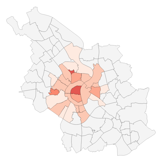
Here is the result (click for the interactive part):
Creating an animation
As a last exercise, let’s add a button that automatically goes through the time periods one by one. As a result, we get an animated visualization. The code is similar to what we have just done: We add a toggle button widget with a callback function. This time however, we use JavaScript for the callback function. This is because we use timers, which are not supported by flexx:
#  Add Animation: Automatically loop through data source
output_file("kvb_js_dynamic_animate.html")
# add button with callback to control animation
callback = CustomJS(args=dict(p=p, source=source), code="""
        var data = source.data;
        var f = cb_obj.active;
        var j = 0;

        if(f == true){
            mytimer = setInterval(replace_data, 500);
        } else {
            clearInterval(mytimer);
        }

        function replace_data() {
                j++;
                if(data[j] === undefined) {
                    j=0;
                }
                p.title.text = "Bike density per district in period: " +j;
                data['rate'] = data[j];
                source.change.emit();
        }
        """)

btn = Toggle(label="Play/Stop Animation", button_type="success",
                active=False, callback=callback)

show(column(widgetbox(btn,slider),p))
Each time the toggle button is clicked cb_obj.active changes from true to false or vice versa. This triggers the start of a timer which calls the replace_data() function. There, we replace the measure for rate with the one corresponding to the current period j. Additionally, we update the title of the plot to display the period number. Above that, We increment the period j with each function call. When we hit the last period, j is reset and we start at the beginning. Et voilá, a nice in browser animation of the changes during a day: