Investigating bike rentals in Cologne - Part 3: Descriptive Statistics
After gathering and cleaning data on rental bikes in Cologne, we already looked at map visualizations. Here, we will dive into the data more deeply. Using descriptive statistics we will try to find interesting patterns. For this, we will use the pandas library. It is great for manipulating and analyzing data. Moreover, we will use matplotlib and seaborn to visualize some of our findings.
You can find the data used in this post here. This post was written in a jupyter notebook. You can also find it at github.
Let’s get started by setting up things:
import numpy as np
import pandas as pd
import matplotlib.pyplot as plt
import seaborn as sns
from geopy.distance import vincenty
import warnings
warnings.simplefilter('ignore')
# define style of plots
%matplotlib inline
plt.style.use('ggplot')
plt.rcParams["figure.figsize"] = (10,8)
After setting up the environment, we read in the data and drop some unnecessary columns. Following, we take a first glance at the structure:
BIKES_COMBINED = "../data/bikedata_10min-int-observ_Feb-March.csv"
bikes = pd.read_csv(BIKES_COMBINED)
bikes.drop(['u_id','bike_name'], axis=1, inplace=True)
bikes.scrape_datetime = pd.to_datetime(bikes.scrape_datetime)
bikes.head(5)
| bike_id | scrape_weekday | lat | lon | scrape_datetime | |
|---|---|---|---|---|---|
| 0 | 22460 | Sun | 50.933528 | 6.995009 | 2017-02-05 00:00:02 |
| 1 | 22134 | Sun | 50.896996 | 6.980310 | 2017-02-05 00:00:02 |
| 2 | 21911 | Sun | 50.967579 | 6.936491 | 2017-02-05 00:00:02 |
| 3 | 21522 | Sun | 50.975012 | 7.007270 | 2017-02-05 00:00:02 |
| 4 | 21914 | Sun | 50.970199 | 6.900565 | 2017-02-05 00:00:02 |
We have one observation for all bike locations (lat and lon) every ten minutes. The bikes can be identified by their bike_id.
If a bike_id is missing at one observation point it means that the bike is currently not available. This is the case when a bike is in use. Alternatively, the bike (or the GPS) could be broken or under maintenance. This structure has a downside. Because the number of rows per bike_id varies, it’s impossible to work with averages. Thus, we make it more consistent by adjusting the number of rows / observations for each bike_id:
# Same number of rows for each bike_id -> Align number of observations
bikes = bikes.assign(obs=1).set_index(['scrape_datetime','bike_id']).\
                            unstack().stack(dropna=False).reset_index()
bikes.head(5)
| scrape_datetime | bike_id | scrape_weekday | lat | lon | obs | |
|---|---|---|---|---|---|---|
| 0 | 2017-02-05 00:00:02 | 21004 | Sun | 50.954703 | 6.889604 | 1.0 |
| 1 | 2017-02-05 00:00:02 | 21005 | None | NaN | NaN | NaN |
| 2 | 2017-02-05 00:00:02 | 21006 | None | NaN | NaN | NaN |
| 3 | 2017-02-05 00:00:02 | 21007 | Sun | 50.909306 | 6.944799 | 1.0 |
| 4 | 2017-02-05 00:00:02 | 21008 | Sun | 50.941107 | 6.997360 | 1.0 |
In result, we have a row for each bike_id for every scrape_datetime. If the bike was really observed at this time we have obs = 1. Otherwise, we know the bike was not actually available.
If between two (actual) observation points the coordinates have changed, the bike has been used. Accordingly, we can create a dummy variable to indicate this. We do this by grouping the data by bike_id and applying a function to every non-empty row in the lat column. The function checks if the difference between the current and previous row (i.e. the current and previous observation) is greater than zero:
# Compute dummy (0/1) for location changes:
# did coordinates change between two observations?
bikes['change'] = bikes[bikes.obs==1].groupby('bike_id')['lat'].\
                        apply(lambda x: abs(x.diff()) > 0).astype(int)
bikes.loc[bikes.change.isnull(), "change"] = 0
Now, that we know a bike was used let’s find out what distance it traveled. Because we only have the start and end point of the journey this will be a rough estimate. We can expect the actual distance to be significantly longer. To achieve this, first we create a new column. It contains the coordinates shifted by one observation period for each bike. Then, we create the index m that includes all rows in our data where the bike has been used. Using this, we can compute the distance between the actual coordinates and the shifted coordinates. This is done by applying the vincenty function from the geopy package to each row in m:
# Compute Trip Distance when coords changed
bikes['coords'] = bikes[['lat','lon']].values.tolist()
bikes['coords_shifted'] =  bikes[bikes.obs==1].groupby('bike_id')['coords'].shift()
m = bikes['coords_shifted'].notnull() & bikes['change'] == 1

bikes.loc[m, 'trip_distance'] = bikes.loc[m, :].apply(
    lambda x: vincenty(x['coords'], x['coords_shifted']).kilometers, axis=1)
Visualizing will give us a good impression about the typical distance of trips. We do this by using seaborn to draw a histogram:
# seaborn histogram - exclude missings
ax = sns.distplot(bikes.trip_distance[bikes.trip_distance.notna()],
                  kde=False, bins=100)
ax.set_xlim(0,10)
ax.set_title("Histogram of bike trip distances")
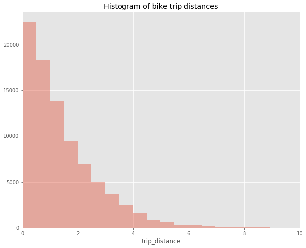
Most trips are rather short. Typically, they will be under two kilometers. Trips above four kilometers distance are the exception.
As a next step, we can start to look at some descriptives for the usage and distance variables we’ve just defined. Let’s take a look at the usage first:
# Compute some descriptives statistics on bike usage
length_observ_period = (bikes.scrape_datetime.dt.dayofyear.max()\
                            - bikes.scrape_datetime.dt.dayofyear.min()) + 1
num_bikes = len(bikes.groupby('bike_id'))
usage_mean_daily = np.mean(bikes.groupby(bikes.scrape_datetime.dt.dayofyear).change.sum()
                           / num_bikes)
num_observ_per_bike = bikes[bikes.obs.notna()].groupby(['bike_id']).size()
print("Days in dataset: ", length_observ_period)
print("Number of bikes: ", num_bikes)
print("Daily mean usage per bike: ", usage_mean_daily)
Days in dataset:  41
Number of bikes:  1230
Daily mean usage per bike:  1.7067023597065238
During our observation period of 41 days we have 1230 different bikes on the streets. On average a bike is used 1.7 times a day. Hence, there are about 2100 trips made each day.
Taking advantage of the possibility to directly plot pandas DataFrames and Series with pyplot we look at some graphs:
ax = num_observ_per_bike.hist(bins=int(num_bikes/20))
ax.set_title("Total observations")
ax.set_xlabel("number of observations")
ax.set_ylabel("number of bikes")
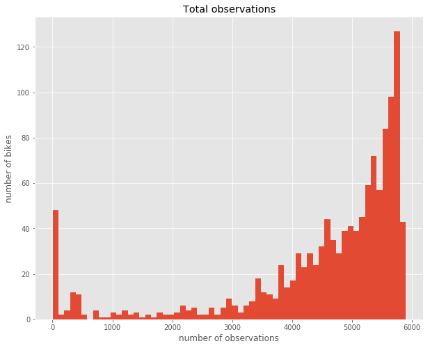
We see that there are about 50 bikes which have almost no observations in our data. Also a few others have less than 3000. Above 3000 there is a steady increase. Probably, bikes with very few observations have broken down at some point at the beginning of the period. However, bikes that have been used a lot will also have fewer observations. Consequently, there are quite a few bikes that seem to be used very rarely. Next, I’d like to get an overview over the number of bike rentals during our observation period. A very intelligible way to visualize a single measure over a time period are calendar heatmaps. The calmap library simplifies creating such charts. Here is what we have to do:
# Calendar Heatmap
import calmap

# Compute Total usage per day
grp = bikes.groupby(bikes.scrape_datetime.dt.date).change.sum()
# Convert to DatetimeIndex for plotting
grp.index = grp.index.to_datetime()
# Plot the calmap and add legend/colorbar
fig = plt.figure()
cax = calmap.yearplot(grp)
cax.set_xlim(5,12)
fig.colorbar(cax.get_children()[1], ax=cax, orientation='vertical')
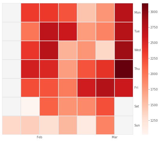
The resulting chart gives away a lot of interesting patterns. First, we see that the number of rentals per day varies greatly. It has a low of about 1000 and a high of 3000. Then, we learn that on weekends rentals are the lowest. In contrast, Fridays seem to be quite popular for renting bikes. There is a lot of variance from week to week even between same weekdays. During all days in the 4th week rentals were very low. As opposed to this, rentals throughout the 2nd and last week were high. If we looked at a longer time period, we would probably see seasonal patterns as well.
Next, we look at differences between weekdays more closely. For that, we will depict the distribution of rentals by weekday using grouped box plots:
weekday_index = ["Mon","Tue","Wed","Thu","Fri","Sat","Sun"]
bikes_weekday = bikes.groupby(['bike_id', "scrape_weekday"]).change.sum().unstack()\
                                / length_observ_period * 7 * num_bikes
# reorder columns
bikes_weekday = bikes_weekday[weekday_index]
# draw boxplots with our DataFrame
ax = sns.boxplot(data=bikes_weekday)
ax.set_title("Mean Usage of bikes by weekday")
ax.set_xlabel("weekday")
ax.set_ylabel("bikes used")
print("Total number of bikes used per weekday on average: ", bikes_weekday.mean())
Total number of bikes used per weekday on average:  scrape_weekday
Mon    2338.734940
Tue    2469.297945
Wed    2276.813934
Thu    2606.723549
Fri    2471.326781
Sat    1652.402089
Sun    1569.121447
dtype: float64
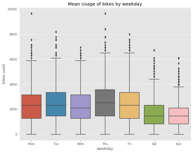
As seen before, Thursdays and Fridays are the most popular rental days. More than 2500 trips are made on average on these days. On the weekends there is a massive drop. Usage is almost 40% lower compared to the weekdays. This indicates that commuting between home and work (or school / university) is the dominant use case for rental bikes. Let’s follow up by looking at how rentals change during the course of a day:
usage_by_hour = bikes.groupby(bikes.scrape_datetime.dt.hour).change.sum()\
                                                        / length_observ_period
ax = usage_by_hour.plot()
plt.xticks(range(0,24)[::2])
ax.set_title("Usage of bikes by hour")
ax.set_xlabel("time")
ax.set_ylabel("bikes used")
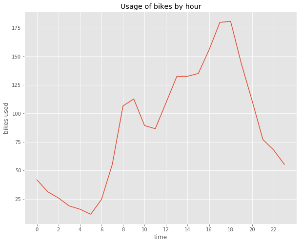
The graph aboves shows the usage of bikes by hour of the day for an average day. We see that the usage takes off at about 6 a.m. in the morning. It climbs to its first peak at around 9 and then drops somewhat. This corresponds well with people going to work. Then, at about 11 a.m. usage starts to increase steadily. The maximum is reached at about 6 p.m. Again, this fits the fact that people use the bikes to return back home after work. Thereafter, there is an even decline until the minimum at around 5 a.m. Let’s see if there is a difference in this graph between weekdays and weekends:
# Compute Usage by time for weekdays vs weekends
usage_by_hour_wd = bikes[bikes.scrape_datetime.dt.weekday <= 5].groupby(
                       bikes.scrape_datetime.dt.hour).change.sum() / (length_observ_period * 5/7)
usage_by_hour_we = bikes[bikes.scrape_datetime.dt.weekday > 5].groupby(
                       bikes.scrape_datetime.dt.hour).change.sum() / (length_observ_period * 2/7)
# Draw two plots for comparing week vs. weekend use
plt.subplot(2, 1, 1)
ax = usage_by_hour_wd.plot()
plt.xticks(range(0,24)[::2])
ax.set_title("Usage of bikes by hour\nWeekdays")
ax.set_xlabel("time")
ax.set_ylabel("bikes used")

plt.subplot(2, 1, 2)
ax = usage_by_hour_we.plot()
plt.xticks(range(0,24)[::2])
ax.set_title("Weekends")
ax.set_xlabel("time")
ax.set_ylabel("bikes used")

plt.tight_layout()
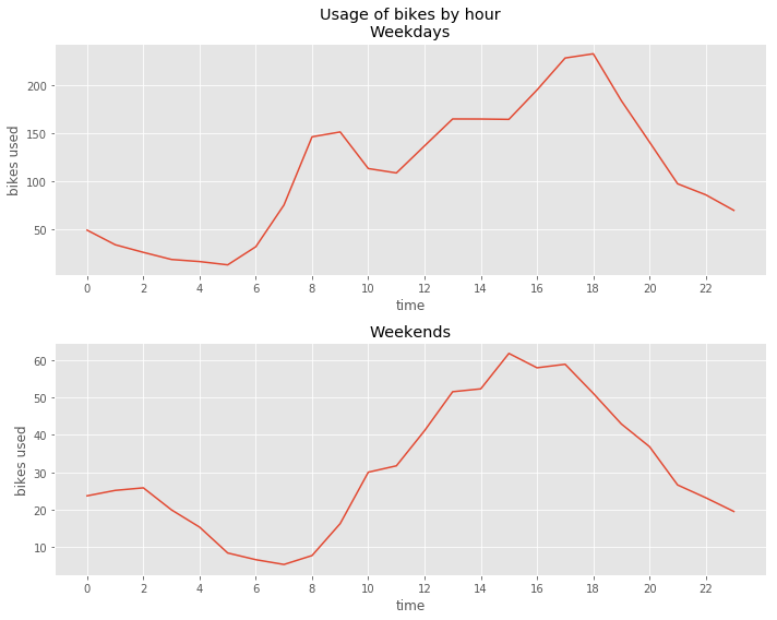
A few interesting points can be taken from this comparison. On the weekends, bike rentals in the morning begin to increase two hours later. Also, instead of the two peaks during weekdays there is only one peak. This speaks for the fact that commuting to work does not play a major role on weekends. Moreover, there is an increase of night time rentals between 11 p.m. and 2 a.m. This is consistent with a leisure oriented use of the bikes. Moving on, we investigate the traveled distance by first looking at some descriptives:
# Compute descriptive stats on distance
distance_total = bikes.trip_distance.sum()
distance_by_bike = bikes.trip_distance.sum() / num_bikes
distance_by_day = distance_total / length_observ_period
distance_by_hour = bikes.groupby(bikes.scrape_datetime.dt.hour).trip_distance.sum()\
                                                            / length_observ_period
distance_by_weekday  = bikes.groupby(['scrape_weekday']).trip_distance.sum()\
                                                       / length_observ_period * 7
print("Total distance: ", distance_total)
print("Total Distance per bike: ", distance_by_bike)
print("Total distance per day: ", distance_by_day)
print("Average distance per hour: ", distance_by_hour)
print("Average distance per weekday: ", distance_by_weekday)
Total distance:  120799.78858713032
Total Distance per bike:  98.21121023343927
Total distance per day:  2946.3363070031783
Average distance per hour:  scrape_datetime
0      61.618007
1      45.893735
2      42.977367
3      29.953201
4      27.588448
5      15.331579
6      33.689674
7      78.382511
8     154.956016
9     174.225709
10    125.791852
11    117.863162
12    134.439276
13    163.887926
14    173.059349
15    189.615456
16    219.522643
17    264.317294
18    264.098703
19    197.830509
20    150.793323
21    108.055639
22     92.281110
23     80.163819
Name: trip_distance, dtype: float64
Average distance per weekday:  scrape_weekday
Fri    3445.663328
Mon    2988.295342
Sat    2141.913185
Sun    2172.674696
Thu    3564.889144
Tue    3249.941301
Wed    3060.977152
Name: trip_distance, dtype: float64
Here, we look at the traveled distance during the 40 day period at hand. All bikes taken together have been rode for more than 120.799km. Traveled by car, this would sum up to about 15 tons of CO² emitted. On average, each bike was used for a total of about 100km or 2,5km a day. In general, there are no big surprises here. The overall picture is analogous to what we’ve seen for the usage. What might be interesting, though, is calculating the distance per trip. So let’s give it a shot:
# plt.figure(figsize=(8,10))
plt.subplot(2, 1, 1)
ax = usage_by_hour.plot()
plt.xticks(range(0,24)[::2])
ax.set_title("Usage of bikes by time")
ax.set_xlabel("time")
ax.set_ylabel("bikes used")

distance_per_trip_by_hour = distance_by_hour / usage_by_hour
plt.subplot(2, 1, 2)
ax = distance_per_trip_by_hour.plot()
plt.xticks(range(0,24)[::2])
ax.set_title("Average trip distance by time")
ax.set_xlabel("time")
ax.set_ylabel("av trip distance")

plt.tight_layout()
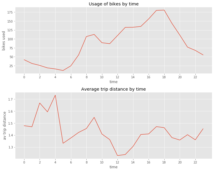
Above, we compare the average trip distance with the average number of rentals by hour. A striking finding is the increase in trip distance observed between 22 p.m. and 4 a.m. While not many people rent bikes during this time span those who do tend to ride for above average distances.
This concludes the first statistical analysis of the data. But there is so much more that we can look at. Consequently, in a follow up post I’ll start applying machine learning to the data. Especially, in combination with supplemental data sources there are much more insights to be gained!