Choropleth Maps with bokeh: basic interactivity
In a previous post we used bike data on KVB-Bikes to create a map visualization. The result was a choropleth map built on matplotlib and basemap. It was neat but tricky to create and static. Here, I will present an alternative way. Using the bokeh library for python, it is possible to create visualizations targeted for web browsers. They look stunning and are interactive. Following the “Texas unemployment” example in the bokeh documentation we will redo our choropleth map example of rental bike density in Cologne’s districts.
UPDATE: You can find data similar to the one used in this article here. Because it is slightly different you will have do adapt the read_data function below.
Setting up required packages
First, we need to install bokeh. As always, it makes sense to work in a virtual python environment. If you use the Anaconda distribution / conda this gets you set up:
conda install bokeh
Alternatively, you can use pip:
pip install bokeh
Getting started
You can find the whole code on github. Here, we will go through it step by step. Lets define the imports and some functions first:
import pandas as pd
import fiona
import numpy as np
from bokeh.io import show, output_file
from bokeh.models import ColumnDataSource, HoverTool, LogColorMapper
from bokeh.palettes import Reds6 as palette
from bokeh.plotting import figure, save
from bokeh.resources import CDN
from shapely.geometry import Polygon, Point, MultiPoint, MultiPolygon
from shapely.prepared import prep

# Veedel - converted with ogr2ogr from original offenedatenkoeln.de data
PATH1="./maps/offene/Stadtteil_WGS84"
shapefilename = PATH1

def read_data(filename):
    colnames =["scrape_date","scrape_time","scrape_weekday","u_id","bike_id","lat","lon","bike_name"]
    with open(filename,"r") as f:
        data = pd.read_csv(filename, names=colnames,nrows=1000 )
    data = data[data.bike_name.str.contains("BIKE")].reset_index()
    data.scrape_date = pd.to_datetime(data.scrape_date) # Convert to datetime object
    data.scrape_time = pd.to_datetime(data.scrape_time, format="%H-%M-%S")
    return data

def calc_points_per_poly(poly, points): # Returns number of points contained
    poly = prep(poly)
    return int(len(list(filter(poly.contains, points))))
To see an explanation of the functions read the previous post on choropleth maps. Again, the shapely imports will be used to deal with the points and polygons that represent our bikes and districts. The fiona library is used to read the shapefile including Cologne’s districts. As before, we read in a .csv file containing data on bike locations. Then, we convert the location coordinates to shapely Points:
data = read_data("/home/flopp/Documents/Coding/kvb/data/2017-03-01.csv") # Read bike location data
map_points = [Point(x,y) for x,y in zip(data.lon, data.lat)] # Convert Points to Shapely Points
all_points = MultiPoint(map_points) # all bike points
Bokeh itself cannot deal with shapefiles. Hence, in order to draw our map of Cologne’s districts we need to extract and convert the information contained in the shapefile. To do so, we open the file with fiona. Then, we extract a number of relevant features. The most important one being the coordinates which define the polygons representing the neighborhoods. For plotting the polygons, bokeh expects two lists. One for the x and one for the y coordinates of the districts. Each of those contains other lists which themselves contain all corresponding coordinate values for the current polygon / district. The other features we use are the names and area of the neighborhoods:
shp = fiona.open(shapefilename+".shp")
# Extract features from shapefile
district_name = [feat["properties"]["STT_NAME"] for feat in shp]
district_area = [feat["properties"]["SHAPE_AREA"] for feat in shp]
district_x = [[x[0] for x in feat["geometry"]["coordinates"][0]] for feat in shp]
district_y = [[y[1] for y in feat["geometry"]["coordinates"][0]] for feat in shp]
district_xy = [[ xy for xy in feat["geometry"]["coordinates"][0]] for feat in shp]
district_poly = [Polygon(xy) for xy in district_xy] # coords to Polygon
Now, we calculate how many points are contained in each polygon, i.e. the number of bikes per district:
num_bikes = [calc_points_per_poly(x, all_points) for x in district_poly]
bikes_per_area = [x/y*10000 for x,y in zip(num_bikes, district_area)]
These are all preparations needed and very similar to what we did previously. Now, it is time to create the visualization with bokeh. First, we define a color palette. It is very similar to the one we used with matplotlib:
# prepare plotting with bokeh
custom_colors = ['#f2f2f2', '#fee5d9', '#fcbba1', '#fc9272', '#fb6a4a', '#de2d26']
color_mapper = LogColorMapper(palette=custom_colors)
source = ColumnDataSource(data=dict(
    x=district_x, y=district_y,
    name=district_name, rate=bikes_per_area,
))
With this, we also tell bokeh where to find the data that will be plotted. The rate argument defines the values that will be used to color each patch / area. Here, we want the color to depend on the density of bikes in each district. Moving on, we define some options for the interactive plot:
TOOLS = "pan,wheel_zoom,reset,hover,save"
p = figure(
    title="KVB bike density per district, Mar. 2017", tools=TOOLS,
    x_axis_location=None, y_axis_location=None
)
p.grid.grid_line_color = None
p.patches('x', 'y', source=source,
            fill_color={'field': 'rate', 'transform': color_mapper},
            fill_alpha=0.8, line_color="black", line_width=0.3)
Finally, this takes care of the infos displayed when hovering over our map. It also exports the plot to an .html file and shows it:
hover = p.select_one(HoverTool)
hover.point_policy = "follow_mouse"
hover.tooltips = [("District", "@name"),("Bikes per km²", "@rate"),("(Long, Lat)", "($x, $y)")]

output_file("kvb_interactive.html")
show(p)
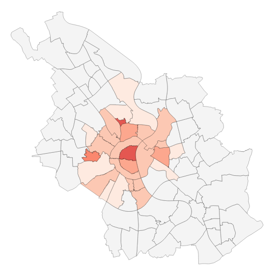
That’s it! Here is the result (click for the interactive part):
In this follow up post, I investigate how to add a dynamic component to the map. Namely, adding the possibility to visualize changes in the data, e.g. how does the distribution of bikes change in time.